I make maps for everything.
When planning a roadtrip. When visiting a new city. When tracing the path of a creek from its source to the sea. When drafting a practical roundup article for a local magazine or researching an urban design question like, Are there any public spaces near the airport where people can watch planes?I also make maps in my work as an urban designer, to test and validate my observations about development patterns. I start with a hypothesis like, North Clayton has become the main hub for food manufacturing and distribution in Atlanta. Or, Atlanta’s biggest film production studios are all on the southside, anchored by the airport. Then I ask myself, can I prove it with a map?
My homemade maps help me organize trivia; understand spatial relationships, distances, adjacencies; and connect the dots. Most of all, maps help me tell stories.I use Google Earth and Google Maps for many of these purposes. It’s easy to drop pinpoints on a satellite map, to group and categorize locations, measure distances and areas, and pull up current names and addresses of businesses. But there are limits to what these resources can provide, specifically in terms of historical context. In the airport area, so many streets and neighborhoods have been erased over time. The ATLMaps platform, however allows me to bring together geo-referenced scans of archival maps from the digital collections of GSU and Emory that show Atlanta’s planning history and help me sift meaning out of the endless data provided by Google.
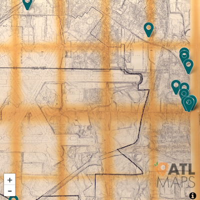
To date, I’ve created two projects on ATLMaps. My first is called I’m From Here and illustrates the scale of residential displacement caused by airport expansions since 1967. Juxtaposing GSU’s archival planning maps of the airport area with today’s concourses shows the dramatic scale of erasure on the southside. It’s breathtaking to me, as a southside native and airport geek, but when I show that overlay in presentations it brings people to tears. It’s powerful evidence that these places existed and that story hasn’t been told for decades. I’m From Here was one visual iteration of my research which informed my book Flight Path.I have often been told that people read my essays with a map in one hand (or browser). So for the ATLMaps translation of my Art Papers essay “Achieving Blankness: Notes from the Edge of the Atlanta Airport,” I accepted that the best way to illustrate a bike ride around the airport was to show (not tell) the loop on a map and invite readers to choose their own adventure. This spatial rather than linear structure allowed me to chop out a lot of exposition and jump straight into the action and observations.
But I also use the platform often to quickly access City’s Map for Land Use (1952), Negro Residential Areas (1966), or the Atlanta Airport Property Map (1967). It seems like once a week I find myself puzzling over an altered landscape, trying to see the before and after. Were these neighborhoods connected before the interstate highway was constructed? Why does the street change names here? What is this meadow in the middle of a neighborhood? Google Maps can indicate a floodplain; HistoricAerials.com will show an snapshot of the past, but only the layers in ATLMaps reveal the city’s organizing principles, the invisible infrastructure of flight paths and Jim Crow. For these maps are like an x-ray of our city, exposing the bones of our urban form.
Citation: Palmer, Hannah. “Sifting out the Stories with ATLMaps.” Atlanta Studies. September 14, 2017. https://doi.org/10.18737/atls20170914.


